| View previous topic :: View next topic |
| Author |
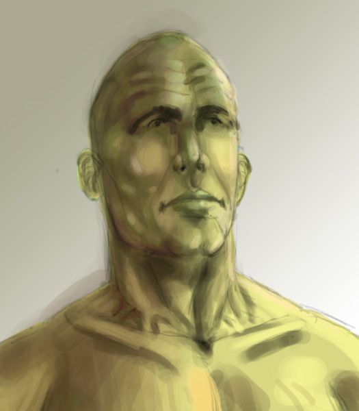
Topic : "Bald guy..." |
Zorglub
member
Member #
Joined: 20 Dec 2000
Posts: 268
Location: Ontario Canada
|
 Posted: Mon Nov 19, 2001 5:51 pm Posted: Mon Nov 19, 2001 5:51 pm |
 |
 |
Still working on my anatomy and shading...
Any comments or suggestions are strongly encouraged 
 |
|
| Back to top |
|
bottrishish
junior member
Member #
Joined: 14 Sep 2001
Posts: 31
Location: ohio
|
| Posted: Mon Nov 19, 2001 6:23 pm |
|
|
| That looks really good! If i were you i would make the highlights more obvious, and the shading darker. The only anatomy problem i could see is the eyes. They need more. Thats just my opinion. |
|
| Back to top |
|
johnnyp
junior member
Member #
Joined: 14 Oct 2001
Posts: 27
Location: Milwaukee, WI
|
| Posted: Mon Nov 19, 2001 6:26 pm |
|
|
Nice Image!
I would suggest deepening the eyes a bit. They sockets look a little flat. Also, the ears seem a bit low to me and not perspectively accurate for the angle his head is at. The figures right ear seems as if it should be flatter to the skull and perhaps a little higher.
I really like the neck though, and the overall feeling of the image. Keep up the good work!  |
|
| Back to top |
|
Zorglub
member
Member #
Joined: 20 Dec 2000
Posts: 268
Location: Ontario Canada
|
| Posted: Tue Nov 20, 2001 5:25 pm |
|
|
| Hey guys thanks for the complimets and the suggestions. Yes the eyes are flat because they are just leftovers from the original sketch. I also agree about the ear and the stronger contrast between highlights and shadows - this is something that has been pain and it still is |
|
| Back to top |
|
|


